Google DevFest UK & Ireland 2021: "What I Learned from Building a Flutter App for Cat-Sitters"

Logistics
Conference
DevFest UK & Ireland 2021 was a hybrid one-day conference. It took place in London and online on January 29, 2022. The Google Developer Group (GDG) community organized it. The conference had three on-site tracks and seven online tracks.
Talk
My talk was on-site on Saturday, January 29, 2022 at 5.30 pm. The talks don’t have a URL of their own. Instead, they are overlay windows. So please go to the conference schedule page, go to the last row for the 5:30 pm talks, scroll to the right and click on my talk title.
Abstract
Cat-sitters in the UK are less familiar with smartphones than average users. An app for their job is just a tool that needs to work and then gets out of the way. And in their work, they often have no or just a shaky network connection.
My challenge was to build iOS and Android apps for these users while simultaneously working on the Angular web app for managers and the Java back-end. I’m the lone developer in the SaaS start-up “Your Home In Good Hands”. How could I succeed?!
That’s where Flutter and Firebase came to the rescue: Flutter allowed me to build mobile apps efficiently. And services like Firebase Authentication, Firebase Storage and Google Maps did much of the heavy lifting. I’ll discuss the advantages of Flutter and Firebase and how I dealt with Flutter challenges.
My talk also details how I made the mobile apps easy to use and how they work offline. Finally, I’ll discuss how the mobile and web apps share a design language while respecting their platforms.
Slides
Here are the slides as PDF. They are 4.7 MB:
You can also get the slides in their original Keynote format. “Keynote” is Apple’s presentation application. Why would you do that? My slides have less text than the PDF version, so you can see what I cut. I also animated the slides, so they are more pleasant to watch. Or maybe you want to peek under the hood to see how I achieved specific effects. These slides are 11.2 MB.
ADVERTISEMENT
Developer job ads down 32% year over year, Stack Overflow questions dropped 55% since ChatGPT. I now recommend IntelliJ Community Edition because many AI code assistants don't run in Eclipse. Job ads for Quarkus hit an all-time high.
See All Issues & Subscribe
Additional Talk Information
I Give Advice
The start-up I co-founded is called “Your Home in Good Hands”. We’re currently in private beta. Our service will be publicly available later.
Here are some good design books:
- The Design of Everyday Things by Donald A. Norman
- Don’t Make Me Think by Steve Krug
- The Mom Test by Rob Fitzpatrick
Flutter 👍🏻
I have a page dedicated to getting started with Flutter. Please check it out!
I’m not ready to fully share our app. We do have screenshots on our home page, but they are slightly out-of-date.
But I did build a prototype in 2019 wHich at least shows a Flutter app in motion. Although it’s a bit old, this is still a decent example of what a native Flutter app can look like. It took me about six weeks and was my first Flutter project. I used Google’s cloud service Firebase for login, No-SQL database, and file storage. I also built my own back-end with Java, JHipster, Spring Boot, and Angular.
Firebase 👍🏻
I also have a page dedicated to getting started with Firebase. Please check it out!
Think Different
Storing data locally and loading & saving data in the background is easy with Flutter. But we can also do in a web application. It’s more difficult and more restricted, but it’s doable.
I know because at the end of 2019, I built such a web application. That was a so-called progressive web app (PWA). A PWA uses the “Service Worker” in a browser to install on your device and cache data. It took about four weeks, and it was my first PWA. I used Google Workbox for this but developed my own offline storage solution in the browser. I built my back-end with Java, JHipster, Spring Boot, and Angular.
One Source Of Truth
My Start with Flutter page explains the use of Redux as a data store.
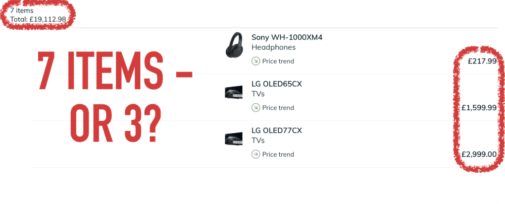
Here is another example of UI inconsistencies. It’s from the iPad app of the UK price comparison site Pricespy. That app isn’t sure whether my list has seven items (top left) or just three (right):
Be Bold
Here is an example how Apple makes button signifiers stronger. Signifiers make affordances (“Does something”) clearer. Some buttons in Apple Music now have a slight grey background to stand out - but not all of them. I believe this is a new feature in iOS 15, introduced in September 2021 or later:

The talk showed how in Android, buttons that change data are orange, and buttons that cancel or go back are gray. It’s the same in iOS:

The talk also showed how in iOS, the “junk drawer button” has a label. It doesn’t in Android because by convention, the floating action button there is just a symbol. But at least it’s also orange:

Be Consistent
My start-up offers a web app for managers and a mobile app for cat-sitters. So arguably, consistency between them is nice-to-have.
Now most managers are also cat-sitters. So they use both apps. This makes consistency a necessity!
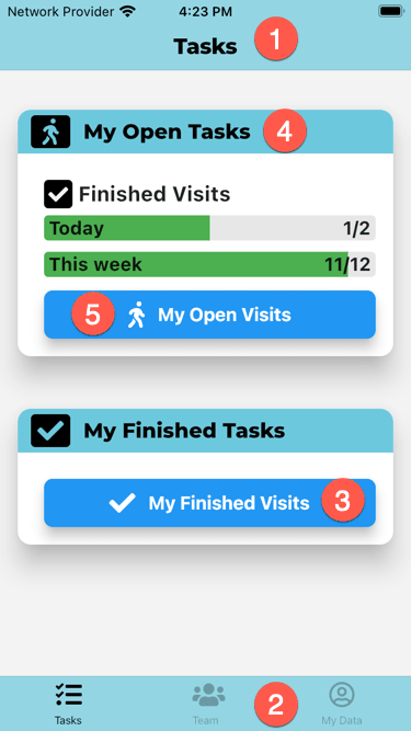
So let’s look at the two apps. Here is the mobile app for cat-sitters:
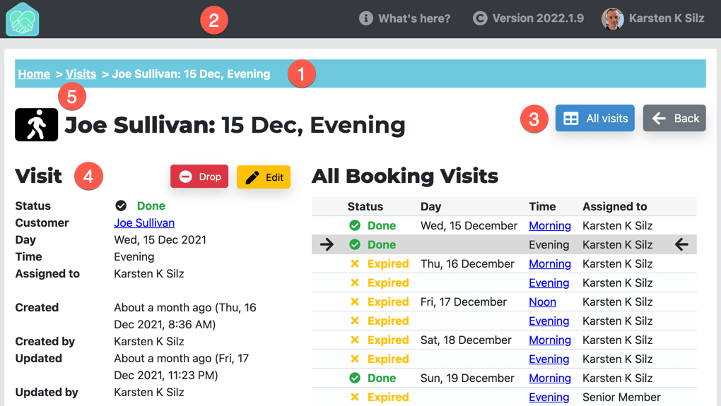
And here is the web app for managers:
So how is this consistent - or how is different?
- Both apps use different navigation paradigms. The mobile app has a nav bar at the top (1) and a tab bar at the bottom (2). The web app has breadcrumbs (1) and a header (2).
- Both app share the same colors. For instance, the mobile nav bar (1) & tab bar (2) and the web app breadcrumbs (1) all use the primary brand color. Navigation also uses the same kind of blue (3).
- The apps also use the same Google font for headings (4): Montserrat.
- Finally, the apps share symbols from Font Awesome: A walking person in this example (5).
Flutter Native UI 😒
My Start with Flutter page contains a section that explains the iOS UI elements. It also explains responsive layout in Flutter.
In the talk I mentioned how our users expect a native UI on iOS. Google’s own apps, like Google Maps or Google Mail, have used mostly Material Design UI elements for the last years. Not anymore: In order to “really make products feel great on Apple platforms”, Google is now switching to native iOS UI elements.
If you don’t use both iOS and Android regularly, you don’t know that they are meaningfully different. Even if you try to make them look and feel as similar as possible!
Here’s the “My Data” page from my app, both in iOS (left) and Android (right):
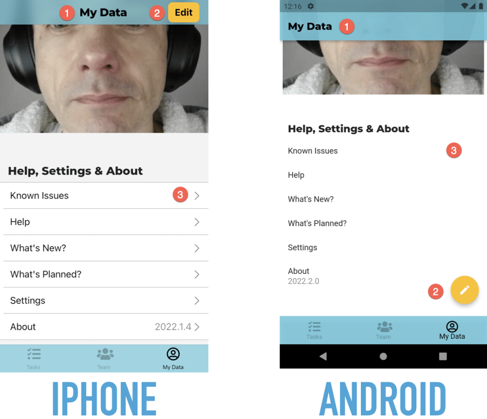
Here are three differences:
- The page heading is centered in iOS and left-aligned in Android.
- The “Edit” button is in the navigation bar in iOS and a floating action button in Android.
- When you can tap on a table row in iOS, it has a chevron on the very right. Android doesn’t have such an indicator.
Forms are also different:
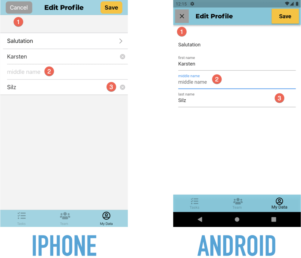
Here are some differences:
- The “Cancel” button has a text label in iOS and a symbol in Android.
- Fields have no label in iOS, just a placeholder when they are empty. They do both a permanently visible label and a placeholder in Android.
- Text fields in iOS have a “Clear” button. Android doesn’t have such a button.
Back To Basics
The Start with Flutter page has an architecture section that explains my proposed use of components & layers.
Get Started With Flutter
Here’s my page for getting started with Flutter.