Summary
Yes, we can build frontends for mobile, web, and desktop from one codebase with Flutter. I wrote a sample app to demonstrate it. But I only recommend Flutter on mobile:
- Flutter on mobile gives us “2 apps for the price of 1”. Flutter code can use native libraries because it can call native code (and vice versa). It can also show both native screens and web views. So Flutter essentially can do everything native SDK apps do, but with a faster build & deploy experience.
- Compared to frameworks like React/Angular/Vue, Flutter web only has the material design look & feel and a small number of libraries.
- On the desktop, I think a web application is fine instead for most cases. If you still want a desktop application: Flutter is only stable on Windows (since February 2022), not on Mac and Linux.
I also can’t recommend Java front-end frameworks:
- Jakarta Server Faces (was Java Server Faces before) can’t build Single Page Applications, hasn’t had new features in five years (though new ones will arrive with Jakarta EE 10 in mid-2022), and is unpopular with employers and especially with developers.
- JavaFX uses a UI builder tool, has no native look & feel and just limited access to native features on mobile, and is unpopular with employers and developers.
Please see my slides for why I came to this conclusion.
Information additional to the slides is below.
And here’s how to get started with Flutter:
Logistics
Event
The London Java Community (LJC) regularly hosts free online talks by industry experts.
Talk
My talk will be on Tuesday, Apr 26, at 13:00 BST. It’s called “Flutter for Java Developers: Mobile, Web & Desktop with 1 Codebase?”.
Abstract
The phone is the main computer for consumers today. Even enterprise users increasingly rely on mobile devices. Now native mobile applications often provide a better user experience than web applications. But developing two different applications for iOS and Android is usually too expensive.
Cross-platform frameworks promise salvation and deliver iOS and Android apps with one codebase. Like Google’s Flutter, some even give us web & desktop frontends, too! And Google says Flutter is “the most popular cross-platform UI toolkit” with half a million apps. I think Google’s Flutter is the best cross-platform option for Java developers. But can it deliver?
I put a native Flutter application into the iOS and Android app stores. My talk describes how Flutter works and how it’s different from other solutions. Based on my experiences, I discuss the advantages and problems of Flutter. And a sample application demonstrates a native look & feel across mobile, web & desktop with one codebase.
Tell Me What to Change Next Time
If you’ve seen my talk, then please tell me what I can do better in my next talk.
Here’s what people said.Slides & Video
Here are the slides as PDF. They have more content and more text than my talking slides. They are 9.8 MB:
You can also get the slides in their original Keynote format. “Keynote” is Apple’s presentation application. Why would you do that? My slides have less text than the PDF version, so you can see what I cut. I also animated the slides, so they are more pleasant to watch. Or maybe you want to peek under the hood to see how I achieved specific effects. The slides also have less words than the PDF ones - it’s a talk, not a read! But they do have speaker notes. These slides are 12.7 MB.
ADVERTISEMENT
Developer job ads down 32% year over year, Stack Overflow questions dropped 55% since ChatGPT. I now recommend IntelliJ Community Edition because many AI code assistants don't run in Eclipse. Job ads for Quarkus hit an all-time high.
See All Issues & Subscribe
Get Started With Flutter
Here’s my page for getting started with Flutter.
Additional Talk Information
How Cross-Platform Frontends
Web
I said that React, Angular & Vue are the three most popular frameworks. I know because for my monthly Java report, I measure the popularity of JVM languages, databases, back-end frameworks, and front-end frameworks. I measure popularity among employers through job ads from 63 countries. For developer popularity, I use online training students, Stack Overflow questions, and Google searches. You can always view the current popularity of web front-ends here. But here are two of the four measurements from my March 2022 report.
The Indeed job search is active in 63 countries representing 92% of the worldwide GDP in 2020. It demonstrates the willingness of organizations to pay for a technology - the strongest indicator of popularity in my mind. Angular is the baseline. Measurements are from August 2021 through April 2022.
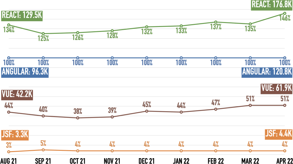
React wins, Angular is second, Vue third. After an Angular surge last September, React is pulling away from Angular again. Vue is slowly gaining on Angular and has nearly reached half of Angular’s mentions. JSF is an order of magnitude behind Vue.
Please see here for details, caveats, and adjustments of the job ad mentions.
Udemy is one of the biggest online learning sites. They publish the number of courses and the number of students (beyond a certain threshold). This shows how many developers evaluate a technology. Angular is the baseline. The other frameworks don’t cross the reporting threshold for Students at Udemy (maybe around 100,000 students). Measurements are from March 2021 through April 2022.
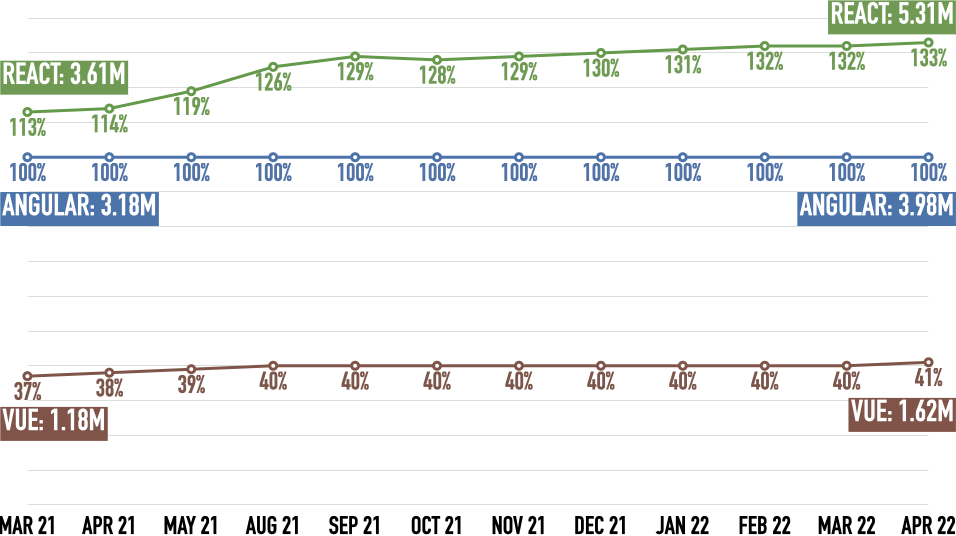
React wins, Angular’s second, Vue is third. React is steadily increasing its lead over Angular. Vue is stuck at 40% of Angular’s students.
Here are the links that show the courses for all and the number of students for some:
Native Look & Feel?
The mentioned native look & feel and that it’s important. Especially on mobile where a vocal minority will complain if an iOS app looks like an Android one and vice versa.
Google’s own apps, like Google Maps or Google Mail, have used mostly Material Design UI elements on iOS for the last years. Not anymore: In order to “really make products feel great on Apple platforms”, Google is now switching to native iOS UI elements.
If you don’t use both iOS and Android regularly, you don’t know that they are meaningfully different. Even if you try to make them look and feel as similar as possible!
Here’s the “My Data” page from my app, both in iOS (left) and Android (right):
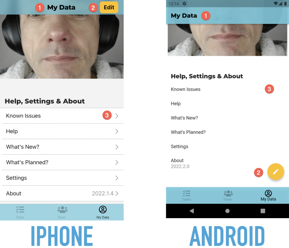
Here are three differences:
- The page heading is centered in iOS and left-aligned in Android.
- The “Edit” button is in the navigation bar in iOS and a floating action button in Android.
- When you can tap on a table row in iOS, it has a chevron on the very right. Android doesn’t have such an indicator.
Forms are also different:
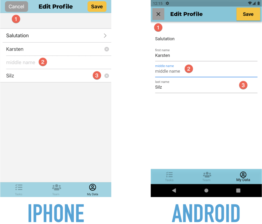
Here are some differences:
- The “Cancel” button has a text label in iOS and a symbol in Android.
- Fields have no label in iOS, just a placeholder when they are empty. They do both a permanently visible label and a placeholder in Android.
- Text fields in iOS have a “Clear” button. Android doesn’t have such a button.
Declarative Model
I have a guide to getting started with declarative development:
How Flutter Works
Widgets
Flutter doesn’t use native UI elements (such as text fields or buttons). Instead, it emulates them. See here for more details.
Widget Sets
I built a sample Flutter application with five different, native “Look & Feels” with one codebase: Web, iOS, Android, Windows, and Mac. I showed screenshots during the talk. You can read more about this application below. You can run it yourself if you have Flutter installed!
My Flutter Experiences
My Project
The start-up I co-founded is called “Your Home in Good Hands”. We’re currently in private beta. Our service will be publicly available later in 2022.
Flutter: Mobile 👍🏻
I have a page dedicated to getting started with Flutter. Please check it out!
Flutter Hot Reload makes code changes go live in the device/simulator immediately. It’s the main reason why working with Flutter can be such fun! Here is a video demonstrating it.
I’m not ready to fully share our app. We do have screenshots on our home page, but they are slightly out-of-date.
But I did build a prototype in 2019 wHich at least shows a Flutter app in motion. Although it’s old, this is still a decent example of what a native Flutter app can look like. It took me about six weeks and was my first Flutter project. I used Google’s cloud service Firebase for login, No-SQL database, and file storage. I also built my own back-end with Java, JHipster, Spring Boot, and Angular.
Firebase 👍🏻
I also have a page dedicated to getting started with Firebase. Please check it out!
Mobile Power
Storing data locally and loading & saving data in the background is easy with Flutter. But we can also do in a web application. It’s more difficult and more restricted, but it’s doable.
I know because at the end of 2019, I built such a web application. That was a so-called progressive web app (PWA). A PWA uses the “Service Worker” in a browser to install on your device and cache data. It took about four weeks, and it was my first PWA. I used Google Workbox for this but developed my own offline storage solution in the browser. I built my back-end with Java, JHipster, Spring Boot, and Angular.
One Source Of UI Truth
My Start with Flutter page explains the use of Redux as a data store.
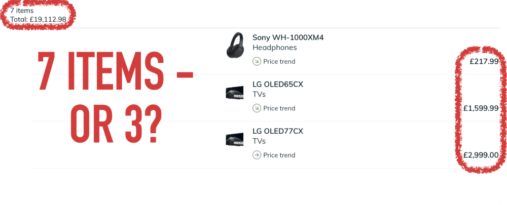
Here is another example of UI inconsistencies. It’s from the iPad app of the UK price comparison site Pricespy. That app isn’t sure whether my list has seven items (top left) or just three (right):
Be Consistent
My start-up offers a web app for managers and a mobile app for cat-sitters. So arguably, consistency between them is nice-to-have.
Now most managers are also cat-sitters. So they use both apps. This makes consistency a necessity!
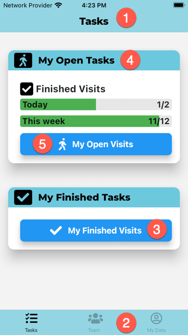
So let’s look at the two apps. Here is the mobile app for cat-sitters:
And here is the web app for managers:
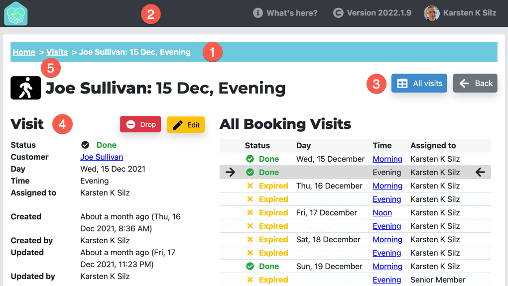
So how is this consistent - or how is different?
- Both apps use different navigation paradigms. The mobile app has a nav bar at the top (1) and a tab bar at the bottom (2). The web app has breadcrumbs (1) and a header (2).
- Both app share the same colors. For instance, the mobile nav bar (1) & tab bar (2) and the web app breadcrumbs (1) all use the primary brand color. Navigation also uses the same kind of blue (3).
- The apps also use the same Google font for headings (4): Montserrat.
- Finally, the apps share symbols from Font Awesome: A walking person in this example (5).
Here are some good design books:
- The Design of Everyday Things by Donald A. Norman
- Don’t Make Me Think by Steve Krug
- The Mom Test by Rob Fitzpatrick
Back To Basics
The Start with Flutter page has an architecture section that explains my proposed use of components & layers.
